See The Percentage Of People In Your County With COVID-19 Or Flu-Like Symptoms
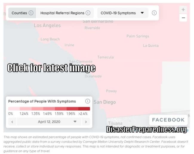
Facebook’s Interactive COVID-19 map integrates data from over 1 million surveyed people and was completed by Carnegie Mellon University researchers utilizing Facebook’s platform.
Click on the map below to determine the estimated percentage of people with COVID-19 symptoms, not confirmed cases. This map is not intended for diagnostic or treatment purposes, or for guidance on any type of travel.
Map loading…
Here’s how Facebook’s Interactive COVID-19 map works:
A county-by-county breakdown of how many surveyed Facebook users reported COVID-19 symptoms.
Additionally, you can also review the number of Facebook users who reported flu symptoms in your county.
Selected Disaster Products
The map can also sort data by “hospital referral regions,” which could indicate which areas’ hospitals are poised to face the heaviest burden.
The interactive map lets you zoom in to view data at the county level.
Facebook said it would continue carrying out daily surveys to keep the map updated. While the map reflected only US counties on Monday, the company said it would start running surveys globally in the coming weeks.
Below is SAMPLE IMAGE For Southern California. Click the image for the latest data.
